Philly Voice – Logo Re-design
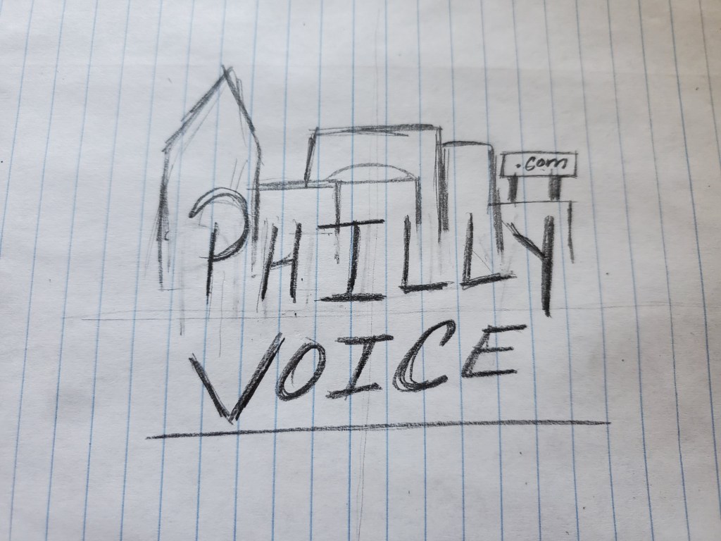
This rough sketch of our new logo implemented multiple of Gestalts rules as well as the CRAP principles. For instance, we felt the need to incorporate some aspect of the city in order to grab attention and also give the logo some life. We decided to keep the original color scheme, except for changing the color of “PHILLY” to a light red to grab attention as well. This also maintains the nice contrast between colors, while at the same time giving readers a little more to engage with.
We also discussed the awkward spacing between the different elements in the original logo. First, “Philly” is barely legible compared to “voice” which is counter-intuitive since the city is what makes this magazine special. Also the “.com” may be necessary to have, however its completely out of alignment with the rest of the imagine and so annoyingly grabs the readers attention, because it feels out of place. Our logo hides the “.com” in a billboard, while the rest of the imagine stays relatively symmetrical.
Phila. Inquirer – Front Page Re-Design
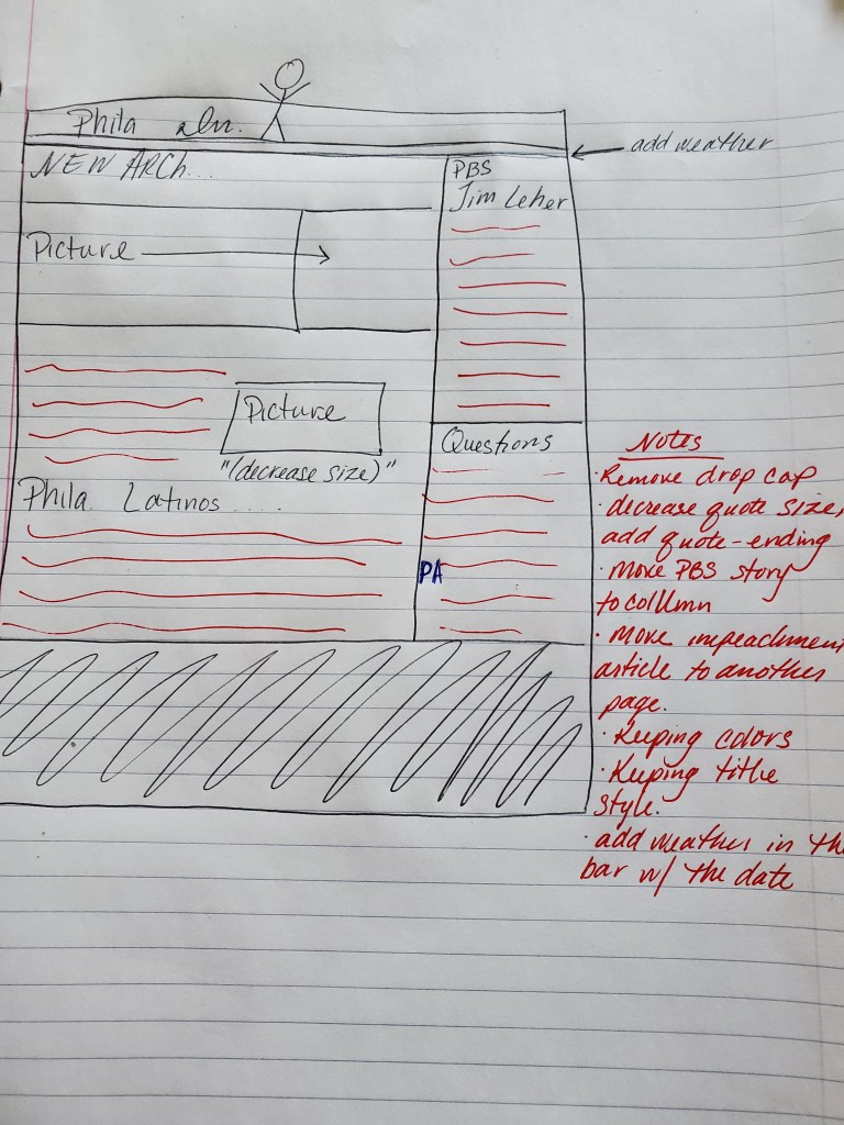
We discussed the need to get rid of the row of story snap-shots and small updates because we decided to try and open up the page a little bit. We started by re-designing the weather so that it is part of the header. We also got rid of the impeachment trial story since it was not our the Inquirer’s story, and the story is also all over every other news site. We also tried to find a way to minimize or hide the spotlight logo, since it takes up so much space.
Mood Board – Rollingstone Magazine – Final
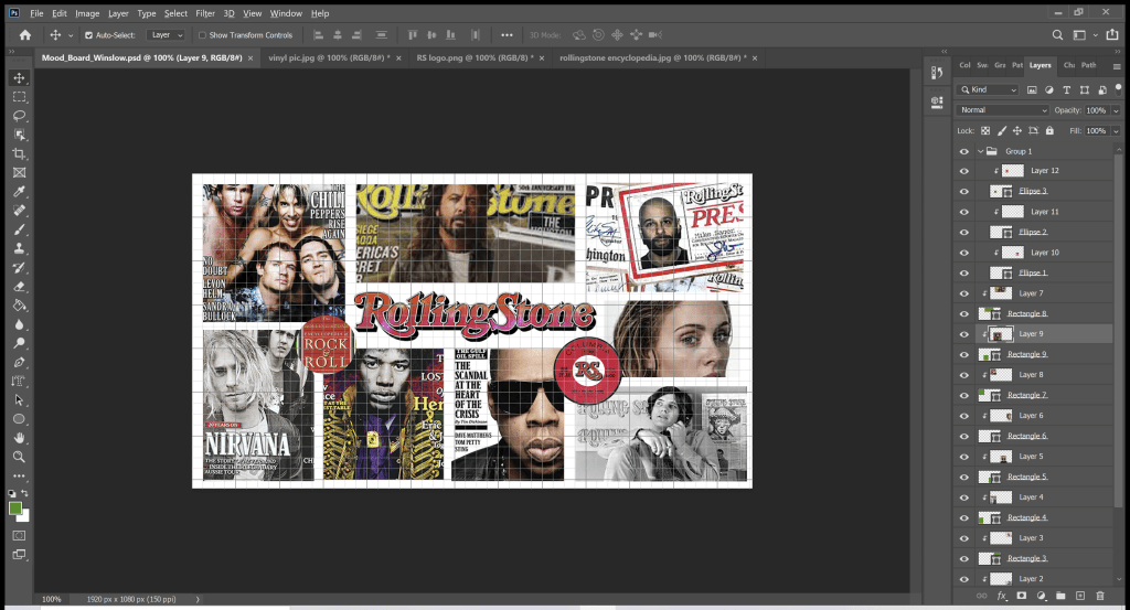
This is the mood board I created for Rollingstone. I chose specific images from the magazines history, such as the bottom right picture depicting the founder of the magazine, Jann Wenner. I also wanted to incorporate some images that showed how much impact the magazine has had on our media consuming culture, like the image of the Rollingstone rock and roll encyclopedia. However, the magazine is mostly for its iconic magazine covers, so I felt that at least a few needed to be part of the board.
Animated GIF
CoVID 19 Infographic
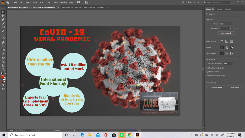
For my infographic I chose my color scheme based upon the colors of the virus itself. So in this case; grey-blue, maroon, and lime green. While playing with the shapes, I discovered that I could kind of get circles to look like molecular structure of the virus and so I tried to position them in a way to still be legible, but also to be interesting and fun to look at. I used these colors throughout my piece to provide contrast and repetition. The greatest challenge was figuring out how to word all of my facts to be able to fit everything inside my limited space, since a lot of my facts had large numbers to begin with.
